Choose
Use chips, single-choice lists, or multi-choice lists when the answer shape is known.
Collect
Use forms when the wizard needs structured fields such as emails, URLs, numbers, dropdowns, or longer notes.
Review
Use editable reviews, summaries, and confirmations before important actions run.
Pattern Reference
In most wizard instructions, describe the pattern you want rather than the raw tool call. For example: “Show chips for Activation, Education, and Expansion” is usually better than pasting a full JSON schema into a stage booster.
Sequencing UI
A wizard can show more than one structured UI surface in sequence. This is useful when a task has several distinct questions or review moments. For example, a gifting wizard might:- Show a single-choice list of gift options.
- Show a form for recipient details.
- Show an editable review of the message.
- Show a final confirmation before sending.
- Each question has a different shape.
- Later questions depend on earlier answers.
- You want the user to review generated content before the final action.
- A required field appears only after a lookup or policy check.
Chips
Use chips for a few short choices that do not need descriptions. Good examples:- Yes / no
- Shorter / warmer / more professional
- Retry / skip / cancel
- Activation / Education / Expansion
- Keep labels short.
- Use chips for 2-8 options.
- Do not use chips when options need descriptions or images.
- For risky choices, use a list or review screen instead.
Single Choice
Use single choice when the user should pick exactly one option from a small set. Good examples:- Pick a segment to test
- Choose one matching contact
- Select an invoice type
- Choose a troubleshooting path
- Confirm which existing project the user meant
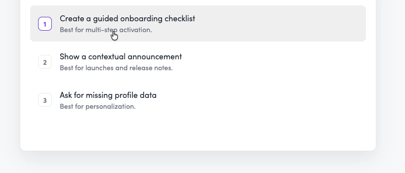
Single-choice options help the user choose one item from a short list.
- Keep the list short.
- Put the most likely option first.
- Include descriptions when labels alone could be ambiguous.
- Use explicit radio-style selection when the choice should not submit on first tap.
- Use an additional option for escape hatches such as “Other”, “None of the above”, or “Add new”.
- For long lists with very short labels, chips can still work. Otherwise use a searchable form dropdown.
Multiple Choice
Use multiple choice when the user can select more than one option before submitting. Good examples:- Select locations to enable
- Pick checklist items to include
- Choose fields to map
- Select actions to add to a wizard
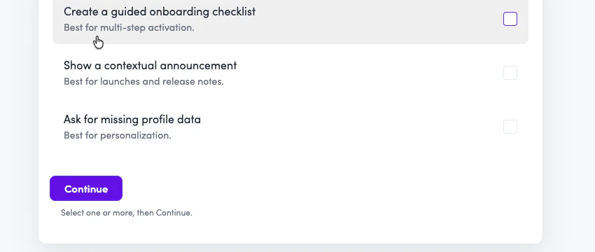
Multiple-choice options let the user select several items before submitting.
- Use multiple choice only when more than one answer is valid.
- Keep option labels scannable.
- Use descriptions when the consequence of each choice is not obvious.
- Use an additional option for escape hatches such as “Other”, “None of the above”, or “Add new”.
- For long lists with very short labels, chips can still work. Otherwise use a searchable multi-select dropdown.
Forms
Use forms when the wizard needs structured input from the user. Good examples:- Email address
- Name and occasion
- URL to test
- Endpoint path and method
- Campaign name, owner email, and message notes
- Dropdown selection from a larger list
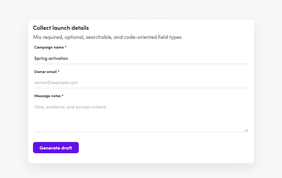
Forms collect structured fields in one step.
- Ask for related fields together instead of one turn at a time.
- Use email fields for email addresses.
- Use number fields for numeric inputs.
- Use textarea fields for prose.
- Use code fields when the user needs to provide JSON, YAML, markdown, or configuration.
- Use searchable dropdowns for long known lists.
- Label fields by what the user should enter, not by what the system will do with it.
Editable Review
Use editable review when the wizard has generated content and the user should inspect or amend it before continuing. Good examples:- Review an email draft
- Edit generated instructions
- Confirm a message before sending
- Tune an action description before saving
- Review a generated prompt before opening an editor
- Use editable review after generation, not for initial data collection.
- Prefill the fields with the generated content.
- Wait for explicit confirmation before running the next write action.
- Do not auto-advance after a tone or content rewrite.
Read-Only Summary
Use a read-only summary when the user needs to review final values but should not edit them in that surface. Good examples:- Gift name, recipient, and total cost
- Invoice client, line items, and total
- Segment name and criteria
- URL rule before updating a placement
- Quote details before submission
- Include the values that matter for user trust.
- Do not show every internal field.
- Use editable review instead if the user should change values directly.
- Pair summaries with confirmation-required actions for creates, updates, deletes, sends, or submissions.
Code Blocks
Use code blocks when the wizard needs to return copyable text, JSON, API details, or code. Good examples:- Installation snippet
- JSON schema
- cURL request
- Agent instruction block
- Markdown template
- Use code blocks for output the user should copy elsewhere.
- Use a form with a code field when collecting code from the user.
- Keep generated code self-contained.
Action Confirmation
Action confirmation appears automatically when an action uses a confirmation-required execution policy. Use this for actions that create, update, delete, send, submit, approve, or trigger an external effect. The user sees what will happen before anything changes.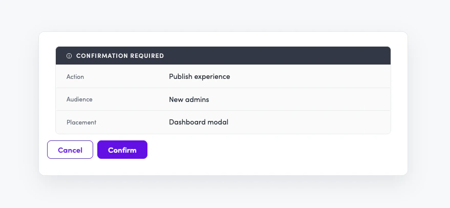
Confirmation-required actions show the payload before anything changes.
- Use Automatic for safe read actions.
- Use Confirm required for writes or external effects.
- Treat a declined confirmation as a valid user choice.
- Do not hide risky changes in chat text.
Runtime Mapping
Most authors should describe the UI pattern they want. The runtime maps those patterns to primitives.Advanced Details
Use these details when writing low-level agent instructions or debugging a wizard runtime issue.Card option presentations
Card option presentations
showSelectCards powers both single-choice and multiple-choice card lists.verticalCards is the default presentation. Use gridCards only when every option has assetUrl; otherwise the UI falls back to verticalCards.Card option extras
Card option extras
Card options support optional
description, assetUrl, prefix, and selected fields.Use prefix only with verticalCards. If you use it, all options should use the same prefix type: number, text, or icon. Do not mix prefix types or add a prefix to only some options.Use selected: true when re-showing a choice and you want an option to start selected. Put selected options at the start of the options array, keeping stable order within selected and unselected groups.Use additionalOption for escape hatches such as “Other”, “None of the above”, or “Add new”. Do not use it for free-text; collect free text with a form.Form field types
Form field types
Forms support:
- Single-line text
- Number
- Textarea
- Code
- Dropdown
- Searchable dropdown
- Multi-select dropdown
Lifecycle tools
Lifecycle tools
progressStage advances to the next wizard step after the current step’s completion criteria are satisfied.dismissModal closes the wizard when it is running inside a modal shell. It is context-specific and should only be used after the task is complete or the user has been navigated to the next place.Copyable code
Copyable code
showCode is read-only. Use it for generated output the user should copy.To collect code from the user, show a form with a code field instead.Common Mistakes
Writing raw tool schemas into stage boosters
Writing raw tool schemas into stage boosters
The model already receives the runtime tool definitions. In most cases, tell the wizard which pattern to use and what content to show, rather than duplicating the full schema in the booster.
Assuming a pattern is available without checking the step
Assuming a pattern is available without checking the step
A wizard can only use the actions and UI patterns available in its current step. When you design or revise a step, check that the step has access to the data it needs and that the intended interaction pattern is supported there.
Putting human tables into boosters
Putting human tables into boosters
Tables are useful in docs, but they are usually a poor format for stage boosters. For agent instructions, prefer direct prose that keeps related conditions in the same sentence, such as “Return up to 12 gift options ranked best first, with the most relevant options first.” Use line breaks sparingly when the relationship between ideas matters; a blank line can make two related instructions feel unrelated.
Asking free-text questions when the answer shape is known
Asking free-text questions when the answer shape is known
If the wizard needs the user to pick a known segment, contact, location, status, or action, use a list, chips, or dropdown. Free text creates unnecessary ambiguity.
Using cards for long lists
Using cards for long lists
Cards are best for short, meaningful choices. If the list is long, use a searchable dropdown.
Using a form for generated content review
Using a form for generated content review
If the wizard generated the content and the user is reviewing it, use editable review. Forms are for collecting input. Review screens are for confirming or amending generated output.
Showing an editable screen when the user only needs to approve
Showing an editable screen when the user only needs to approve
If the user is reviewing final values before a write action, use a read-only summary. If they need to change values, take them back to the previous collection or review step.
Advancing before the step is done
Advancing before the step is done
Only progress when the step’s completion criteria are satisfied. If the wizard advances early, tighten the criteria or adjust the stage booster.